
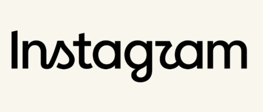
If you opened Instagram on 13 August 2026 and felt like something was slightly off without being able to say what, you were not imagining it. Instagram changed its logo.
But not the logo you are probably picturing.
This distinction is the single biggest source of confusion online right now, so let us clear it up in the first thirty seconds: the colourful gradient camera icon on your home screen has not changed. It is exactly where it was, looking exactly as it did. What changed is the wordmark, the handwritten “Instagram” text that sits at the top of your feed. That script has been untouched for ten years. As of today, it is new.
Adam Mosseri, the head of Instagram, announced it in a post on both Instagram and Threads, and within the first hour more than two thousand people had already piled into the comments to tell him what they thought. Spoiler: opinions are not unanimous.
Here is what actually changed, why Meta did it, and whether the criticism holds up.
Wordmark versus logo, and why the difference matters
A quick bit of vocabulary, because most of the arguments happening online today are people talking past each other.
A logo is the broad term for any visual mark that represents a brand. It can be a symbol, an icon, a piece of text, or a combination.
A wordmark is specifically a text-only design that spells out the brand’s name. Think of the Coca-Cola script or the Google letters.
Instagram has both. The gradient camera square is its icon. The handwritten “Instagram” is its wordmark. Today, only the second one was redesigned.
So when someone tells you Instagram changed its logo and someone else insists nothing changed, they are both partly right. It depends entirely on which mark they are looking at.
What Meta actually said about the redesign
Mosseri’s explanation was short and fairly straightforward. He noted that the wordmark at the top of the app had not changed in ten years, so it was time for a refresh, describing the result as cleaner and more modern while still referencing the original and the simplicity and craft that has always defined Instagram.
Meta’s design team gave a bit more colour in the accompanying news release. According to that release, the team explored hundreds of designs, ranging from all caps treatments to literal handwriting, before repeatedly circling back to a script font with a fluid stroke.
Jasmine Probst, Instagram’s director of product design, explained the reasoning behind that choice. Script reflects individuality, she said, so referencing it felt right. She described the new wordmark as bolder and simpler with touches of unexpectedness, cuing individual expression and personal voice, both of which have always sat at the core of Instagram.
That phrase, touches of unexpectedness, is doing a lot of quiet work. It is design speak for the exact flourishes that people are currently arguing about.
It is not just the wordmark
This is the part most coverage has skipped, and it is arguably more interesting than the logo itself.
Alongside the new wordmark, Meta is rolling out a broader typographic refresh. According to the news release, users will also see an updated version of Instagram Sans, a brand new handwriting typeface called Instagram Pen, and a new Instagram mono font.
That is not a logo tweak. That is a full brand identity system being rebuilt.
Companies do not commission an entire custom type family for fun. Instagram Sans already existed and already worked. Building an updated version plus two additional typefaces suggests Meta is preparing for a visual refresh that extends well beyond one line of text at the top of the app. New fonts get used in Stories, Reels overlays, editing tools, ad formats and interface chrome.
In other words, today’s wordmark is very likely the visible tip of something larger.
The criticism, and whether it is fair
The reaction split roughly into two camps within an hour.
Supporters called it modern and clean but still fun. One commenter said the wordmark had some razzle dazzle to it, which is not a phrase you often see applied to corporate typography but does capture the intent reasonably well.
The critics focused almost entirely on legibility, and specifically on three letters: the s, the r and the g.
One commenter said it was not easy on the eyes, arguing the styling of the g and r felt unnecessary and that the attempt to be distinctive came at the cost of instant readability. Another was blunter, questioning whether it even passes accessibility checks.
And then there is the joke that has taken over the internet today: that the wordmark now appears to read Instagzam, because of the unusual shape of the r.
Here is my honest read on this, as someone who has watched a lot of rebrands land badly.
The legibility criticism is technically valid and practically irrelevant.
It is technically valid because yes, the letterforms are genuinely harder to parse in isolation. The script adds old fashioned curves to the s, r and g, and there is a real generational wrinkle here that is worth noting: cursive handwriting is no longer widely taught to younger users. Someone who never learned cursive may not intuitively recognise that the shape resembling a small sail is meant to be an s. That is a legitimate design consideration, not a trivial one.
But it is practically irrelevant because of something called brand recognition. Instagram is one of the most recognised names on earth, sitting at the top of an app that roughly two billion people already have open. Nobody arrives at that screen wondering which app they launched. The wordmark does not need to work as pure legible text. It needs to work as a signature.
That said, the accessibility question deserves a straighter answer than it is getting. Wordmarks are generally exempt from text contrast and legibility requirements under accessibility standards precisely because they function as logos rather than as readable content. So the wordmark almost certainly passes any formal check. Whether the new custom fonts hold up when used for actual interface text is a much more meaningful question, and one nobody can answer until they ship.
Why now, and why this is not a 2016 repeat
The last time Instagram meaningfully changed its visual identity was May 2016, when it retired the skeuomorphic brown camera with the rainbow stripe and replaced it with the pink and orange gradient square that still sits on your phone today.
That change was genuinely traumatic for a lot of users. It was a total break with the past, it happened overnight, and the backlash was enormous. People made memes, wrote thinkpieces, and installed workarounds to get the old icon back.
Today’s change is deliberately the opposite of that. It is small, it targets the least emotionally loaded part of the brand, and it explicitly references the original rather than abandoning it.
That is not an accident. That is a company that learned something in 2016 and is now being careful.
There is a reasonable case that this is a deliberate first step. Change the wordmark, absorb the reaction, roll out the new type system, and only then consider touching the icon if the appetite is there. Meta has not commented on whether an app icon redesign is coming, which is itself a notable non answer.
What this means if you actually work with the brand
Practical implications, because most coverage stops at the aesthetics.
If you are a designer or agency: Your Instagram brand assets are now outdated. Any pitch deck, social kit, style guide or client template that features the old wordmark needs updating. Note that the icon assets remain valid, so you do not need to replace everything.
If you run a business page or store: Nothing in your account changes. Your profile, posts and analytics are untouched. This is purely a change to Instagram’s own branding, not to yours.
If you use the “Follow us on Instagram” lockup: This is the one place it genuinely matters. Any printed material, packaging, storefront signage or website footer using the old wordmark will start to look dated. Worth adding to the next print run rather than reprinting immediately.
If you build apps or websites: Check whether you have hardcoded Instagram brand assets in your share buttons or social icons. Most icon libraries will update, but not instantly.
The part nobody is discussing
Here is the angle I find most interesting, and it has almost nothing to do with typography.
Instagram is currently competing with TikTok for cultural relevance while simultaneously fending off criticism about AI generated content flooding the platform. A brand refresh built explicitly around individuality, personal voice and handwriting is not a random creative choice in that context.
Probst’s language is telling. Script reflects individuality. The wordmark cues individual expression and personal voice.
Read that again with the AI content debate in mind. Meta is positioning Instagram’s visual identity around human expression at precisely the moment when the biggest criticism of the platform is that it feels increasingly machine generated. A handwritten script is about as strong a signal of human touch as a brand can send.
Whether that positioning is sincere or strategic is a fair question. But it is clearly intentional.
The bottom line
Instagram changed its wordmark, not its app icon. The new script is bolder, curvier and more distinctive, with flourishes on the s, r and g that some people find charming and others find borderline unreadable.
The legibility complaints have a technical basis but very little practical consequence, because brand recognition does the heavy lifting that letterforms would otherwise need to do.
The genuinely significant part is not the logo at all. It is the accompanying type system, including an updated Instagram Sans, a new handwriting face called Instagram Pen and a new mono font. That is infrastructure for a broader visual refresh, and it suggests more change is coming.
As for whether people will get used to it: they got used to the gradient square in 2016, and that was a far bigger break. Give it three weeks. Most of the people currently writing angry comments will have stopped noticing entirely.
The ones who will still care are the designers, and they were always going to have opinions.
Next steps worth taking
Audit your brand assets today. Search your site and marketing files for old Instagram wordmark files. It is a fifteen minute job now and an embarrassing oversight in six months.
Do not rush to replace the icon. The gradient camera square is unchanged. Anyone telling you to update icon assets is confusing the two marks.
Watch for the app icon question. Meta has pointedly not said whether the icon is next. If it changes, that is the moment your brand assets genuinely need a full refresh.
If you are a designer, download the new type family when it becomes publicly available. Instagram Sans has been used well beyond Instagram itself, and the new additions will likely follow the same pattern.
Leave a Reply